Judging covers by the book
Fri 9 Jul 2010 by mskala Tags used: fandom, publishingHere are the covers of two different editions of the book Silver Phoenix, by Cindy Pon. One of them is horribly offensive - "like the ugly, stupid, festering toad that you just can't squash no matter how many times you hit it with a shovel" - and the Web logger on whose site I found the pictures and quote thinks it's obvious which one that is.
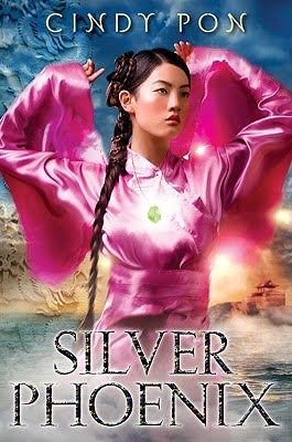

The one on the left is quite sexist (look at the woman's pose, clearly designed to emphasize her breasts) as well as being a tissue of Chinese stereotypes (the hair, dress, eyes, and note that the focus on her breasts also emphasizes how small they are). It looks like a trashy romance novel or "Red Butterfly Love Slaves" (and I am writing this from work, so that link must be suitable thereunto), and it reduces the woman to her ethnicity and sexuality as if those were the only interesting things about her. We all should be outraged by this image.
The one on the right is whitewashed. It's dimly lit, in blue, so you can't accurately tell what colour the woman's skin might be, so you'll assume generic mixed-European "White" by default. It's carefully framed to avoid showing her eyes and hairstyle, and even though she's wearing a low-cut dress such that it would be normal to see cleavage, none is visible. Where the other image went over the top in emphasizing the woman's ethnicity and sexuality, this image treats those things as unmentionable, shameful even. By eliminating important human attributes it's treating her as less than human. We all should be outraged by this image.
I think it's interesting that not only are there reasons to object to either image, but the place I saw these took it for granted which one was supposed to be the bad one. They showed the images, complained about the racism, and only mentioned which one they were upset about offhandedly, way below the fold. I honestly couldn't guess at a glance. I had to read the whole posting carefully to figure it out, and I'm not going to tell you what the answer turned out to be. To my mind, the arguments for why each picture should be offensive over the other are equally legitimate.
Now, it appears that the author of that Web log has some history of writing on similar topics, so presumably regular readers over there already know which side they're supposed to cheer for. Maybe to them it really is obvious, or easy to guess, which objection should carry more weight. Maybe it really is so very obvious to them that the question never even has to be asked. I'm at a disadvantage because I followed a link from a friend's Twitter stream and don't have the context of earlier postings; I also haven't read the book, and from descriptions elsewhere it sounds like having done so might have given me a useful clue as to what I should be offended about. In just the same way, I expect that my regular readers will be well-informed enough to know which argument I'd favour about the offensiveness of the images; but some people will probably read this posting today without having read any of my other writings, so I want to be quite clear:
When I say the two arguments are equally legitimate, I mean neither argument is legitimate, and we all should get over ourselves.
4 comments

Daniel - 2010-07-09 19:17
http://3391.voxcdn.com/wp-content/uploads/2009/12/Last-Airbender-Whitewash-Race.jpg
The other cover is certainly no great advance, with its stereotypical imagery, but if the book is about chinese characters then in my opinion it's a slight improvement.
Daniel - 2010-07-09 19:22
Matt - 2010-07-09 20:11

Cover 1: Late 70s or 80s romance, Probably historical. Almost certainly spanning between China and California with most of the action occurring in California, probably San Francisco, probably the girl was brought against her will and now will amazingly find TRUE LOVE even in this harsh, brutal land. The pendant was given to her by her mother and it's her key to finding her treasure in this new land and the evil Chinese drug lords will stop at nothing to get it. Thankfully, our hero will save her.
Cover 2: Very Twilightesque. This says paranormal to me. The pendant is a talisman that allows her to shape shift. She is a renegade or a bounty hunter either on the run or pursuing someone who is. There will be a romantic component, obviously, but the romance may involve the man who is her enemy; there's conflict there.
And now I'm going to look up more information about this book to see how much of it I can judge by its cover.
And to me, cover 2 doesn't downplay the sexuality of the cover girl, it enhances it by making it mysterious.
Marci - 2010-07-09 15:01